For the past few months my feed has been full of the same promise: connect Claude to Higgsfield, paste one prompt, get the kind of animated 3D product site agencies charge $10,000 for. The reels usually end with "comment a keyword and I'll send you the prompt". Higgsfield itself now ships an official Claude skill that turns a brand kit into a scroll-driven site end to end.
The tools are real. I used the same ones. What I wanted to know is what the promise leaves out, so I built one properly: a concept site for TONI, a matcha tonic my co-founder designed. It's live at toni.shogo.build. Nothing is for sale; it's a concept.
To be clear about who did what: I wrote the brief, set the rules, reviewed every stage and made the calls. Claude Code wrote most of the code and ran the Higgsfield generations. That is exactly why this is a fair test. A capable coding agent, the same generation tools as the reels, and it still took far more than a prompt.
The part that really is easy
The core trick behind those sites is old and simple. Generate a start frame and an end frame, let a video model fill in the motion, cut the clip into stills, and draw one still per scroll position on a canvas. Apple's AirPods page works the same way. The first working version of TONI's spinning can took about an hour and a quarter from an empty folder. If "a can that turns when you scroll" is the goal, the reels are right.
Then I looked at it as a site, and scored it 60 out of 100. It was an animation demo with text around it.
Where it actually got hard
1. Text on a spinning can breaks
A label is the worst case for video generation: small type, on a curved surface, in motion. I ran the same start and end frames through two models. Kling 3.0 cost 8.75 credits per clip and broke the can partway through the turn: a black vertical line runs down it and one face of the label goes blank.

Seedance 2.5 cost 60 credits per clip, about seven times as much, and held the label.

That wasn't the end of it. A 360° turn that starts and ends on the same image risks giving the model nothing to animate, so it became two 180° clips. The second clip came back spinning the wrong way. Writing "clockwise" in the prompt did nothing; describing which faces pass the centre, in order, fixed it. Seedance also shifted the whole image warm, and the two clips came back in different colours, so the join flickered until every frame was colour-corrected to the page background.
2. Sharp on a phone is a separate problem
The can looked soft. The frames were 1920 pixels wide, drawn 1600 CSS pixels wide on a Retina screen that renders every CSS pixel twice, so the screen wanted 3,200. The fix is a rule, not a setting: on-screen size times the screen's pixel ratio must never exceed the frame's own pixels. Phones made it worse. A 1080p clip can't produce a 1080×1440 portrait frame without stretching, so every clip had to be upscaled to 4K before being cut into frames.
3. The naive version is unusable on a phone
To measure the difference, I built the version a one-prompt build tends to produce: every frame of every clip exported as JPEG, all loaded when the page opens, the same images for desktop and phone. Then I timed how long it took for the can to appear on a throttled phone.
54.3 s → 1.0 s
until the can appears on a phone
147.8 → 1.9 MB
downloaded on first load
242 → 120
frames in the hero sequence (desktop)
The fixes were unglamorous: fewer frames, WebP, a separate set for phones, the first frame placed directly in the HTML so it shows before any JavaScript runs, and later sections loaded only as you scroll near them.
The metric that lied
Lighthouse's LCP got worse after optimizing: 1.4–2.6 s before, 2.8–3.0 s after. The unoptimized page never showed the can early, so Lighthouse measured a line of text instead. The optimized page is measured on the can image itself. Read alone, the number says the correct fix made things slower.
4. The award-level sites aren't made of video frames
To get past 70, I studied oryzo.ai, a site by the studio Lusion that presents a cork coaster like a flagship AI product. Its code tells you most of what you need. The main visual is a Three.js scene, not a video. The whole page is one timeline: scroll maps to a single progress value, and the camera, the object, the type and the background all derive from it. Headlines are split into individual letters that rise out of masks. Every button uses the same hover. There are very few colours, a lot of empty space, and one joke running from the first screen to the last.
A one-prompt build gives you motion. What makes a site feel expensive is the decisions made before any motion exists.
So the can stopped being video. It became a real 3D object: my co-founder's flat label artwork wrapped around a cylinder, with aluminium top and bottom. The label can't warp because nothing is being generated. The can turns while the headline slides behind it, falls between sections with real physics, and turns into a line-drawn blueprint before the label wraps back on. Video generation is kept for what it does better than 3D: the can bursting open into matcha powder, tonic and ice, a hand pouring it over ice into a glass, and a burst of each flavor's ingredients on its product page.
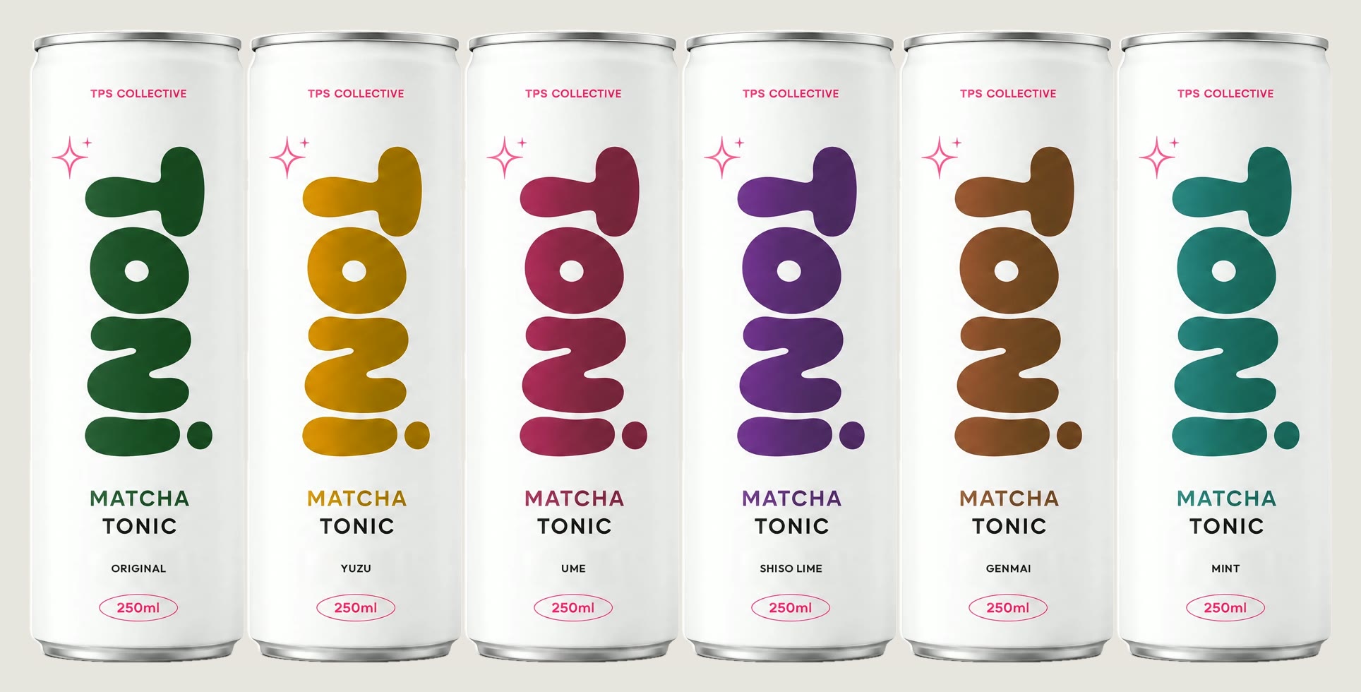
The flavor picker needed several rounds. The first version marked the selected can by stretching it taller, and it looked like a Pringles tube. Now every can keeps its proportions: the picked one comes forward at full size, with a disc of its flavor's colour glowing behind it.
What it actually took
- Just under six hours from an empty folder to the finished site (about four and a half to the first deploy), with an agent working the whole time and me reviewing at each stop
- About 1,270 Higgsfield credits in total. The only video clips that needed redoing were the ones with text on a spinning can; everything after the can became 3D worked on the first try
- A written brief: brand copy taken only from the original concept text, no health claims, a concept notice on every page, checkout that stops at "TONI is a concept"
- A rewrite of the whole direction partway through, after studying what award-level sites actually do
- Many small calls no prompt makes for you: background colour, frame counts, what a selected can should look like, what to leave out
So is the one-prompt claim wrong?
It's true about the first two hours. You really can get a can spinning on scroll from a prompt, and that is new. What it leaves out is everything that makes the result usable as a site: whether the label survives, whether it's sharp on a real screen, whether a phone waits a minute to show anything, whether it looks like every other site built from the same prompt, whether there is a product, a story and a reason to stay.
If someone's selling you the prompt, they're selling the part that's already cheap. The expensive part is the judgment, and it doesn't fit in a comment reply.
About TONI
TONI is a concept brand by TPS Collective. Can and logo design by Tetsuta Endo. Prices, ingredients and nutrition on the site are sample data, and nothing is for sale.